Seneca Savings
Brand identity and strategy for regional savings and loan institution.
Overview
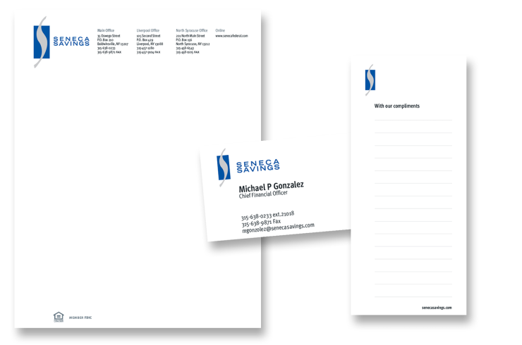
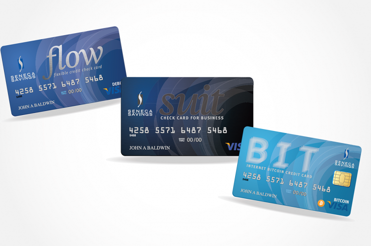
As foot traffic continues to decline, financial institutions are on the hunt for ways to bring consumers to in-person service at the brand, while finding the next generation of customers. After all, branches are home to the high-value consultative services banks and are known for. Consumers who have seen their local bank options dwindle are often left without access to the tools they need to manage their banking and financial lives. With this rebrand, The regional bank required a comprehensive update the identity system for the 85 year old financial institution. The brand program included a new logo type, identity guideline, brand identity elements, lobby communication, website architecture, advertising and promotional design.
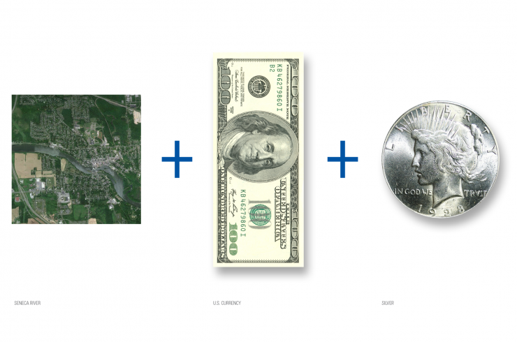
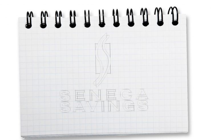
Trademark development was guided by three elements related to the bank. With their founding headquarters in Baldwinsville, NY, we look to the Seneca River for sinuous shape that carve through the village connecting the community to the outside world and relating to an "s" shape. The color blue is informed from the water and to symbolize depth and stability, important for a financial institution. The mark is placed on a rectangle that is in the same proportion of U.S. Currency. We look to the coin for the color to coordinate with blue and represent the oldest and still relevant form of coinage.
Services
- Brand Strategy
- Brand Positioning
- Visual Identity
- Communication Strategy
- Presentation Design
- Brand Guidelines
- Environment Branding



Prototype of location signage using image from original 1962 branch grand opening.
Advertising/OOH Communications
