AXNT Email Marketing
Brand Identity update, content development, communication strategy and product clarification for a modern email marketing provider.
Overview
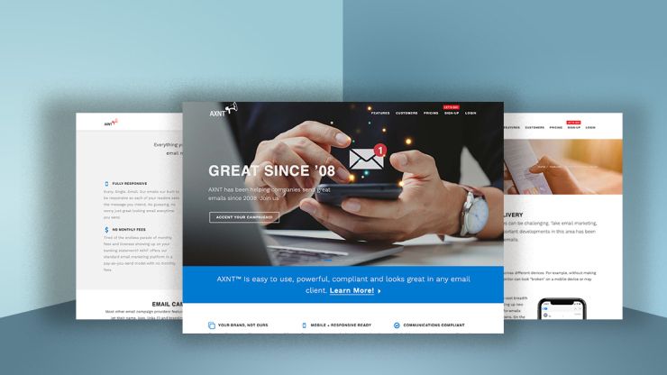
AXNT has been helping clients send compliant email campaigns since 2008. Their previous website was well out of date, and didn't clearly communicate product benefits or offerings. We helped AXNT communicate its' most powerful feature: flexibility. From thier easy to use template systems included in each client account to the freedom of no monthly contracts to deliverability reports, AXNT is one of the greatest little secrets for sending email on the web.
Services
- Brand Identity Update
- Brand Positioning
- Content Development
- Communication Strategy
- Product Clarification
- Custom Programming
Brand Identity Update
The AXNT trademark was had gone through a couple of evolutions early in the company's development before landing on thier type and megaphone lockup. We found a significant symantic problem with the symbol, the megaphone was pointing down, effectively broadcasting to the ground. AXNT reresents such a positive difference when compared to their competition that this was an easy thing to fix, without starting from scratch. Our designers redrew the symbol so that the megaphone was pointing up and out, much like how the broadcast email platform helps thier clients communicate. This small change makes a strong difference in presentation, keeping the visual symbolism positive and looking ahead.
We also added a new color expression for the trademark. The subtle color gradient introduced into the megaphone reinforces direction and vitality.


Typography
With the trademark refined and updated, we turned attention to typography for the balance of the brand system. To coordinate with the original, unchanged AXNT wordmark — set in Univers 67 designed by Adrian Fruitger— we sought to find a modern counter point to this classic sans serif. Our exploration led us to Work Sans.
Work Sans is an open-source variable typeface designed by Australian type designer Wei Huang released in 2015.@nbsp;The font family is inspired and informed by early Grotesque faces such as those by Stephenson Blake, Miller & Richard and Bauersche Giesserei. The complete family includes 10 weights. The 10th Hairline weight is considered a bonus due to limitations of CSS that only allows for 9 weight families.
The font was chosen to represent the brand because the core of the fonts are optimised for on-screen, medium-sized text usage 14px-48px. The typography render extremely well on the printed page or in advertising. Designer Wei Huang shares this about the Work Sans face: "The extreme weights of the family are intended for display use. Because of the focus on digital rendering, features are simplified and optimized for screen resolutions. Specifically, diacritic marks are larger than how they would be in print.”
Work Sans Family
Work Sans is a sans-serif inspired by early Grotesque faces. The font recently received an update, adding true italic styles and a wide range of OpenType features. The face has a slightly playful feel, especially at heavier weights making a friendly presentation for the AXNT brand.


Website Strategy
The biggest issue the team at AXNT was concerned with was that their website platform was out of date. Not only was their CMS old and not up to current standards, the content on the site hadn't really been considered in some time. We worked with AXNT to understand what thier clients love best about the platform, combined with the new features in the most recent version of the AXNT email builder. The new approach to the website also included a revised and simplified sitemap that reinforced the notion of the easy-to-use platform.

Product Clarification, Custom Development
One of the most unique things about AXNT is its no monthly contract model. AXNT clients pay-as-they-go, pay for what they send. As such, feeback recieved from potential clients indicated that campaign pricing was unclear and sometimes "too good to be true" because there was no monthly fees or subscritpions like so much of the SAAS has market. We helped them clarify their product offering and pricing through an easy-to-use interactive calculator that let's clients see the cost of campaigns before sending a single email.
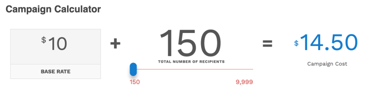
See the Campaign Calculator in use online, visit@nbsp;https://www.axnt.us/pricing
Compliance First and Always
Lots has changed since 2008 when AXNT sent its' first email campaign. AXNT was founded to help people evolve from sending from desktop email clients like Outlook. Since those early email marketing days, most government around the world and at many local levels have implemented strict and stringent laws to help consumers and the companies who send bulk email stay safe, respect privacy and prove compliance is inplace and actively maintained. We created the AXNT privacy communication policy and designed icons to help be clear about CANSPAM, CCPA and GDPR complance practices that AXNT follows.
Visit AXNT™ to see the brand in action.
Related Work

A human identity for a ground breaking research network organization.

Brand identity, content development, website and marketing strategy for commercial real estate brokerage company.

Brand platform and identity system for regional savings and loan bank.

Investor and community communications materials for startup incubator focused on unmanned vehicle industry.